Visualizing Wealth Inequality in the United States
AI Summary
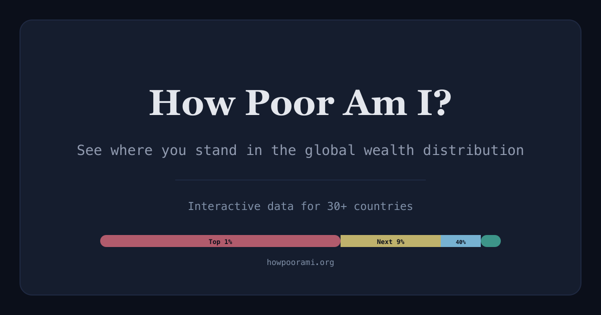
Explore the stark realities of wealth distribution in the United States through an interactive visualization tool. By entering your net wealth, you can see where you stand in the broader spectrum of wealth inequality. The data reveals a significant concentration of wealth among the top 1%, who control 34.8% of the nation's wealth, while the bottom 50% holds a mere 1%. This disparity is further highlighted by the wealth Gini coefficient of 0.83, indicating a highly unequal distribution.
The tool also delves into income distribution, showing that the top 1% earn 20.7% of total income, contrasting sharply with the bottom 50%, who earn just 13.4%. The global perspective is equally stark, with the top 1% owning 42% of global wealth. The visualization underscores how effective tax rates can be regressive at the top, challenging the fairness of the tax system.
Historical data illustrates how policy decisions have influenced wealth concentration over the past century. The visualization uses data from reputable sources like the World Inequality Database and OECD, ensuring a comprehensive and educational exploration of wealth inequality. This tool is designed for educational purposes, emphasizing the complexity of measuring wealth inequality and the importance of methodological choices in data interpretation.
Key Concepts
Wealth inequality refers to the unequal distribution of assets among a population. It is often measured by the Gini coefficient, where 0 represents perfect equality and 1 indicates maximum inequality.
Income inequality is the uneven distribution of income within a population. It is often assessed using the Gini coefficient, similar to wealth inequality, to gauge the disparity between different income groups.
Category
EconomicsOriginal source
https://howpoorami.org/More on Discover
Summarized by Mente
Save any article, video, or tweet. AI summarizes it, finds connections, and creates your to-do list.
Start free, no credit card